
SJX
[Purist]
8540

Part II: Dial
The new look continued
Of the entire watch, the dial design leaves me the most conflicted feelings. It is a strong and distinctive design that incorporates some stylistic elements that are conventionally associated with Cartier. Though overall design is handsome, some of the details are not to my taste.
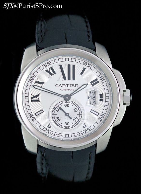
Like the case, the finish on the bezel is careful and well executed. It is concave with a brushed inner ring and a polished top and outer edge. While the visual effect of the concave bezel is pleasing, the polished surface is susceptible to nicks due to its shape and finish.

The dial is fine shade of silver with several textures (brushed, grained and guilloche) and of high quality with precise printed text. It is dominated by a massive “XII” but avoids looking crass with smaller Roman numerals and baton indices for the rest of the dial. All the indices are set on a track with concentric rings. Cartier’s ‘secret signature’ is incorporated into the “X” marker. What gives the dial a modern and sporty feel is the outer railway minute track with Arabic numerals. It works almost as a porthole through which the rest of the dial is viewed.

While the combination of baton and Roman numeral indices seems unusual, the result is pleasing. The baton indices accommodate the sub-seconds dial better as they leave the lower half of the dial less cluttered. Being polished metal with black borders, the baton indices also provide a subtle contrast to the Roman numerals which are black figures with white metal borders.
The hands, on the other hand, are a bit too narrow. They could do with being a bit more substantial to match the overall design of the watch.
Both the seconds sub-dial and date are placed in polished metal frames, highlighting them. I find the numerical markings on the seconds sub-dial unnecessary. They are probably necessary to fill the space on the sub-dial though, without them it would be uncomfortably large and empty.


The most controversial aspect of the dial is without question the date. The aperture displays three consecutive dates with an arrow to indicate the correct date. It is reminiscent of the date aperture on the IWC Top Gun watches. I find it looks odd.

While the date aperture does echo the arc of the crown guard nicely, I would have preferred a conventional date, or maybe one at 6 integrated into the sub-seconds dial. The detailing of the date disc itself, however, is first-rate; it is sandblasted matte silver that is a shade darker than the silvery-white of the dial.

A subtle element that is not readily apparently but frames the dial nicely is the serrated ring running around the perimeter of the dial. Marked with 120 notches, the ring reflects on the edge of the sapphire crystal and gives the dial a bit more depth.

Importantly, legibility is excellent. The hour markers are large and obvious while the minute track is readily apparent. While the hands are slimmer than I prefer, they do are easy to read. Night time visibility is less good, as Luminova is only applied on small markers are 3, 6, 9 and 12 o’clock as well as on the hands. The slim hands do not help legibility in low light.
Overall the dial is attractive and the design elements I find incongruous, like the date, are not apparent on the wrist. I do not like the dial as much as I appreciate the case, but I like it nonetheless.
This message has been edited by SJX on 2010-05-16 00:29:35
The Calibre de Cartier - World's First Review
Part I: Case
Thanks for this report !
Interesting points you make
Hope for Cartier you will be right
Part II: Dial
re date
The 1904 MC will be the base calibre for many other movements
Part III: Movement 1904 MC

most intriguing
2 versions of 1904-PS MC movement
That must be earlier production batch
Worth waiting
The difference is negligible
Agreed
My conversations with Cartier
versions
v1 and v2
Part IV: Strap and buckle
Part V: Variants and conclusion
Great writeup JX...
A rubber strap?
Right on that...
Great report, I knew you would like it
That was one of the main intentions of the watch
I was impressed, until...
Epic failure? I disagree
30m is not safe for swimmingpool

Why is a screwdown crown required for WR?


Great report SJX...
You hit the nail on the head
I agree with SJX
Water Resistance
The Seatimer Calibre

Very nice review SJX...

Impressive write-up, SJX!
Thanks Daos. Good to see we agree on the date.


Love the range.
The rose gols with silver dial is particularly striking

Thanks for the great review of the new Calibre de Cartier SJX!
ADLC is an interesting idea
My thoughts to